
case study 02
La Tavola
A brand for a neighborhood Italian restaurant, all built around one simple idea: the table everyone gathers around.

01
The challenge
La Tavola is a concept I came up with for a family style Italian restaurant. Think handmade pasta, wood fired pizza and long dinners with the people you love.
I wanted it to feel warm and traditional without leaning on the red checkered tablecloth look that so many Italian places use.

02
The approach
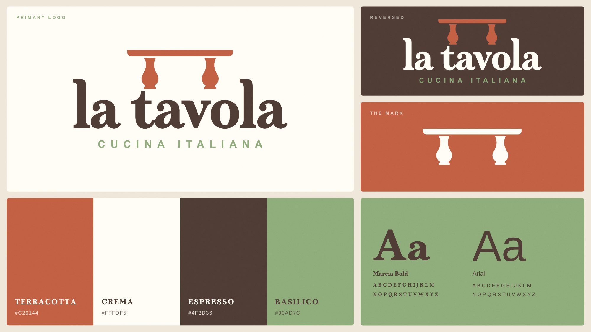
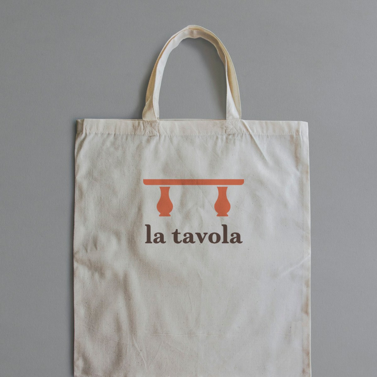
La tavola means “the table” in Italian, so I made the logo one. It's a terracotta tabletop on turned legs, sitting on top of a friendly serif wordmark set in Marcia Bold.
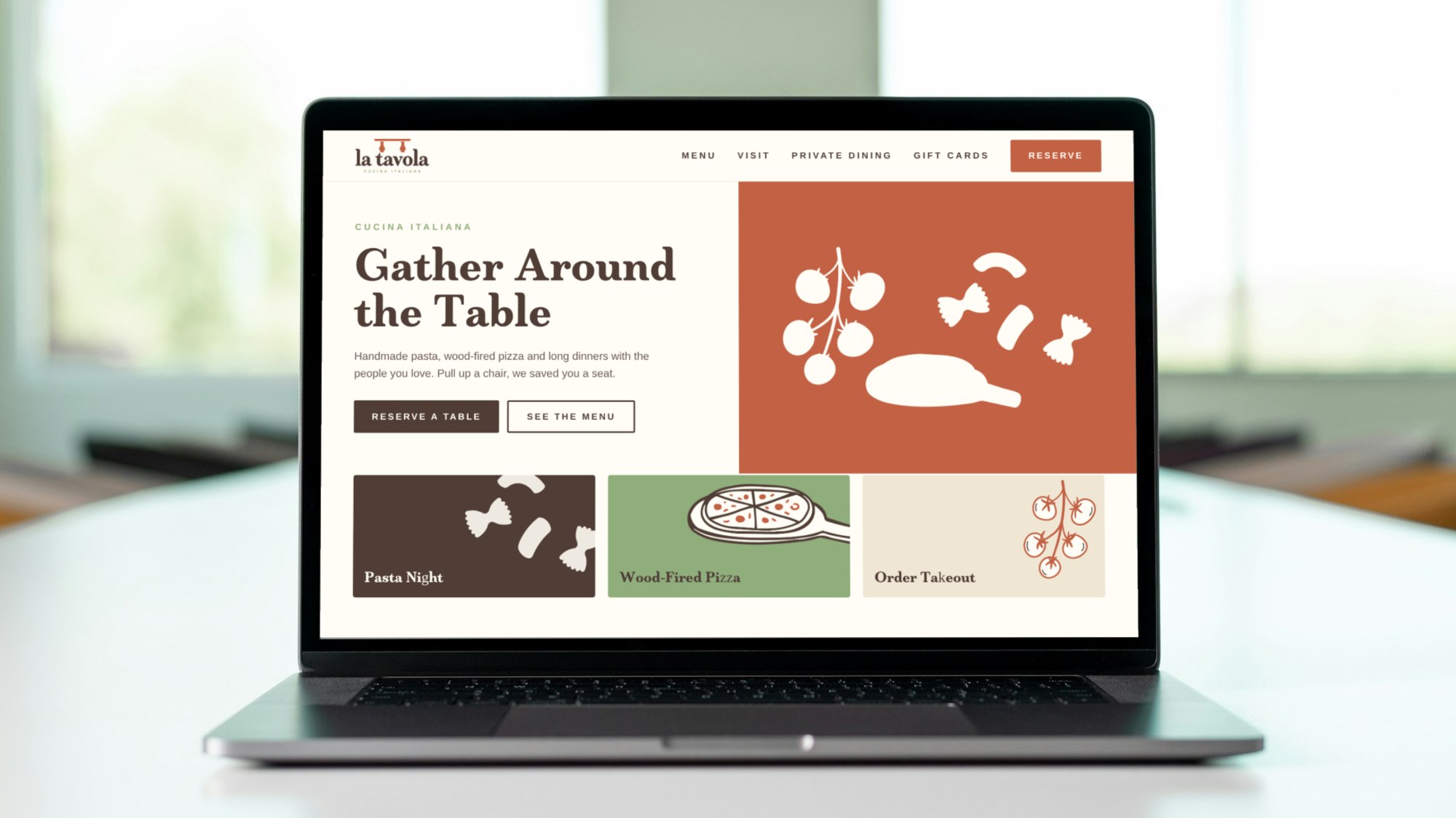
The colors come from clay pots, olive oil and old plaster walls: terracotta, espresso brown, basil green and a warm cream. I also drew tomatoes, pasta and pizza to give the menus, packaging and social posts some personality.
03
The result
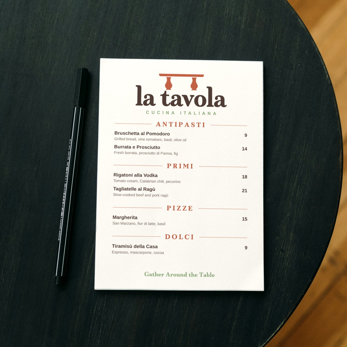
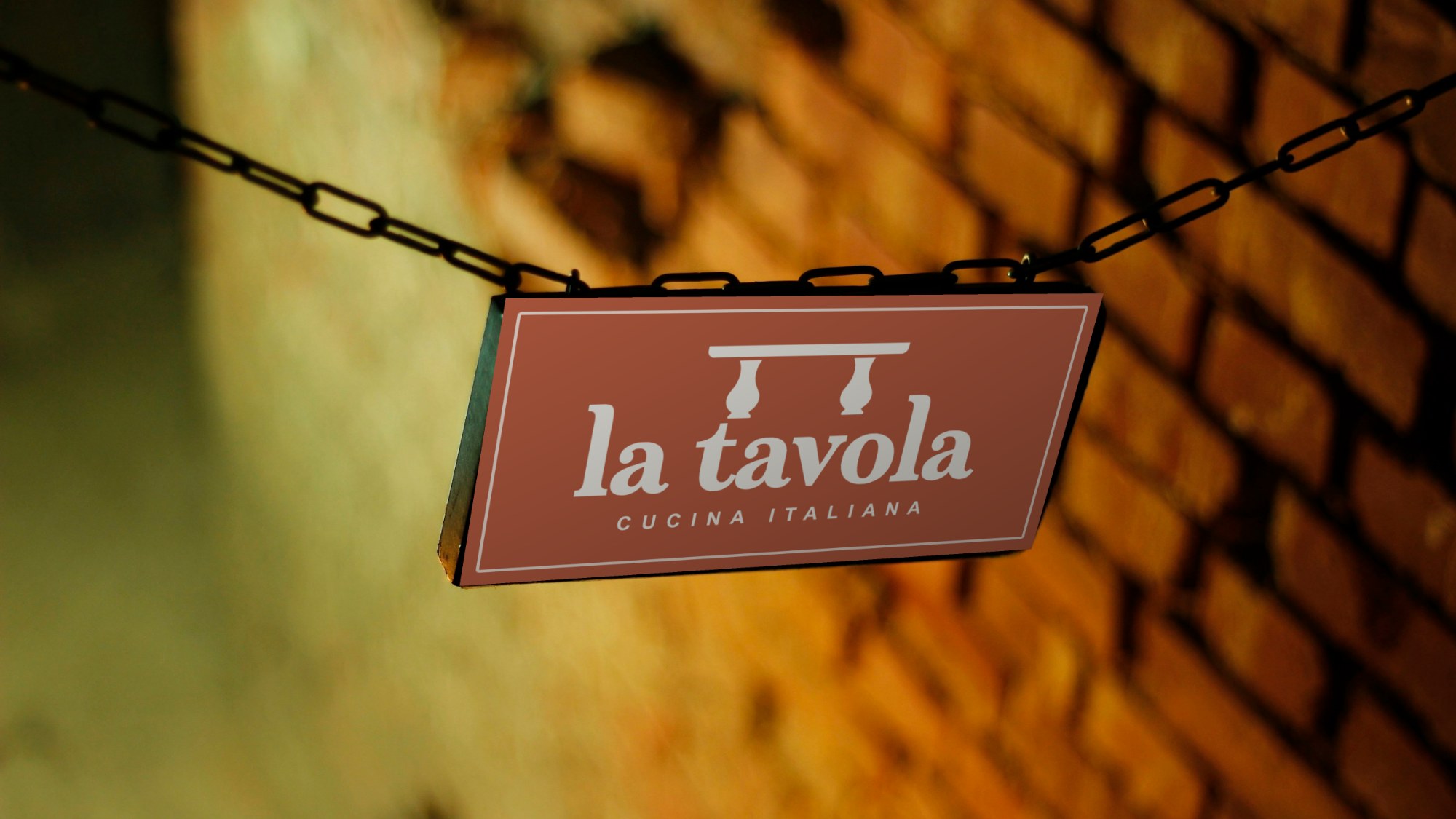
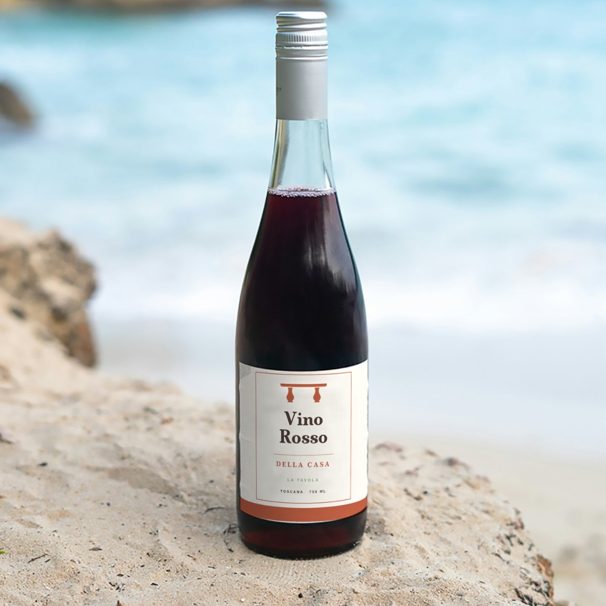
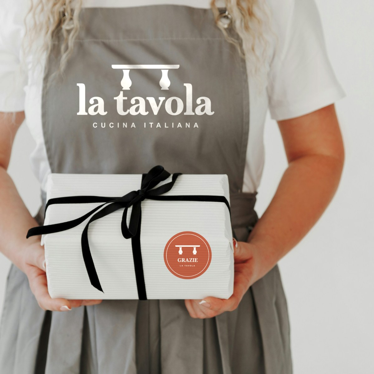
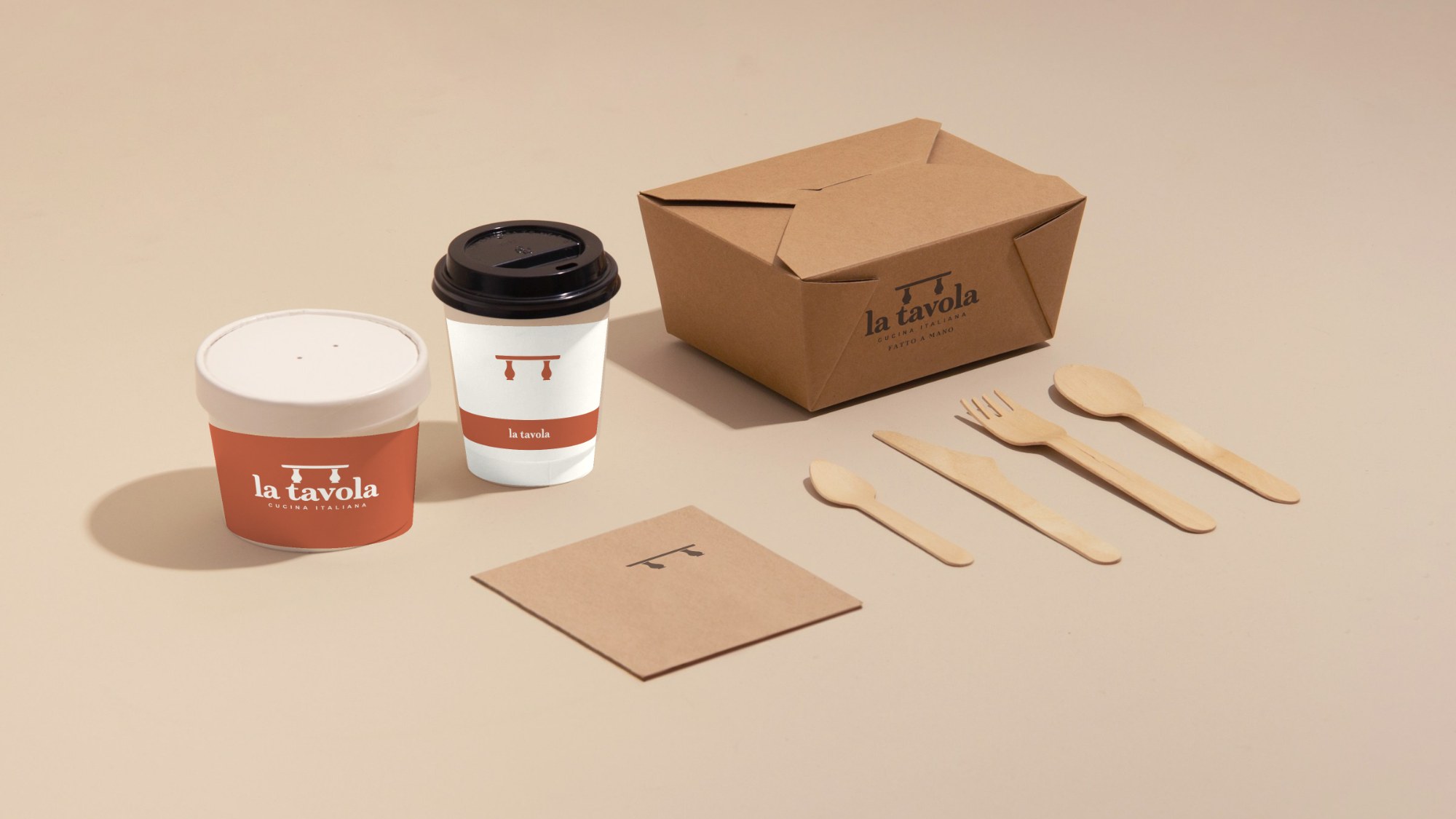
The final system has a main logo, a reversed version, a standalone mark, color and type rules, illustrations and a few slogans. You can see it here on menus, business cards, takeout packaging, signs and social. Every piece is an invitation to “Gather Around the Table.”

up next