
case study 03
No Vacancy Coffee
A late night coffee shop brand inspired by old roadside motel signs. The lights are always on, and there's always room for one more.

01
The challenge
No Vacancy is a concept I came up with for the kind of coffee shop you never want to leave. Somewhere to study, catch up with friends or just hang out for a while.
It needed a big personality but still had to feel cozy, and it had to stand out just as much at night as it does during the morning rush.

02
The approach
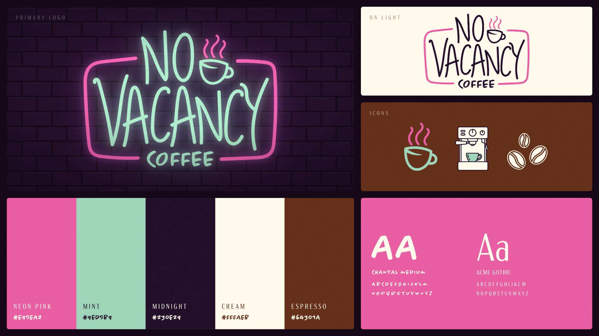
The name flips the classic motel sign around, because here there's always room. I drew the logo to look like bent neon tubing, framed it in pink, and tucked a steaming cup right next to the “NO.”
Neon pink and mint glow against a deep midnight purple, with cream and espresso brown to balance it out. Chantal Medium gives it that hand drawn feel, and Acme Gothic keeps the menus clean and easy to read.

03
The result
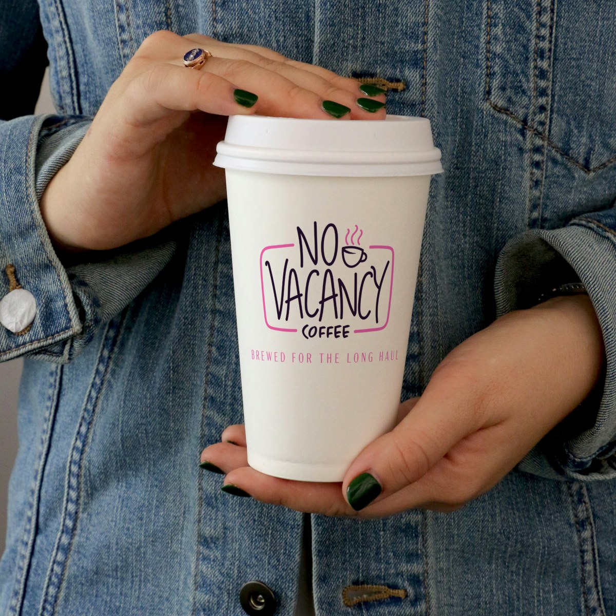
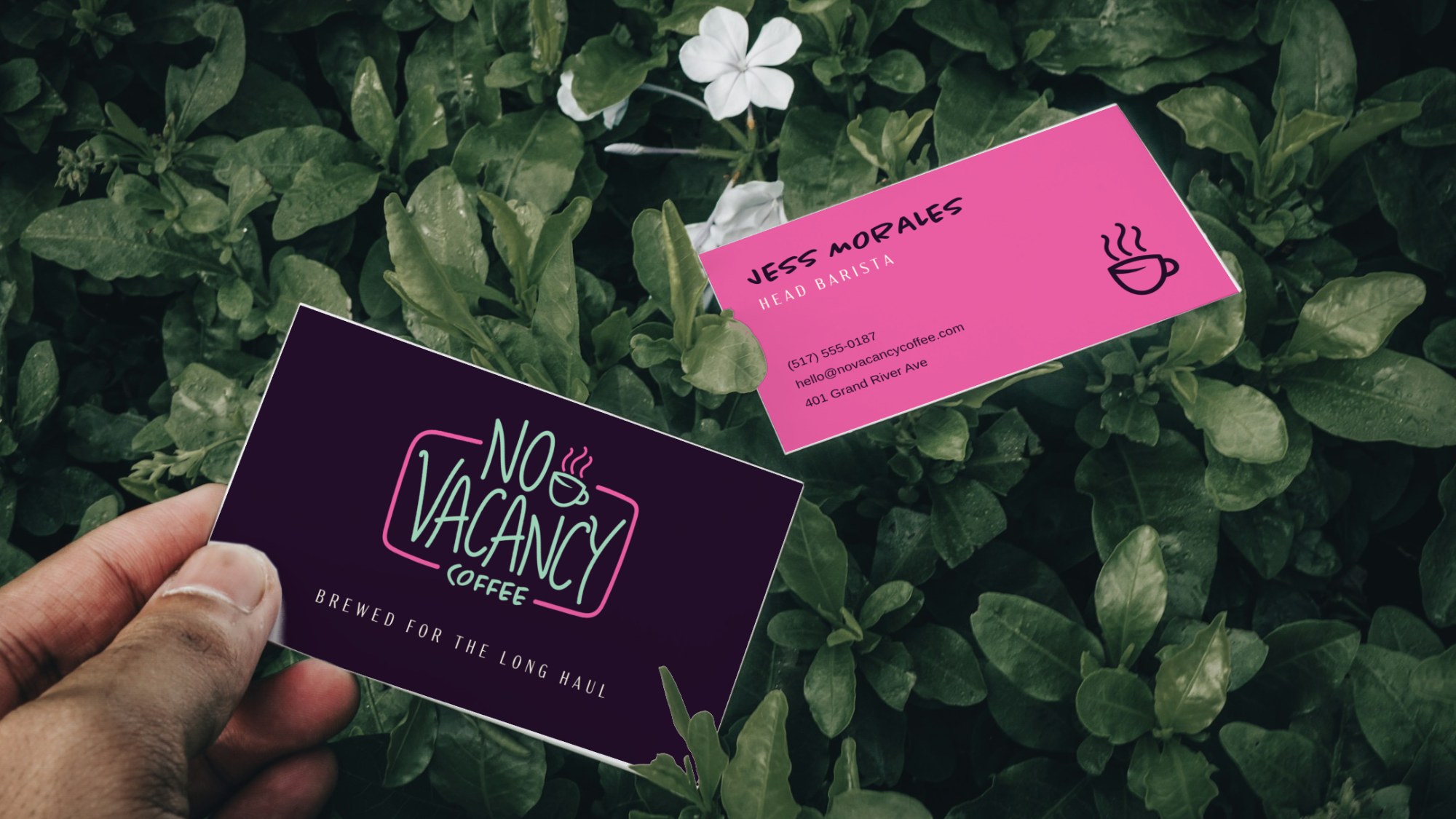
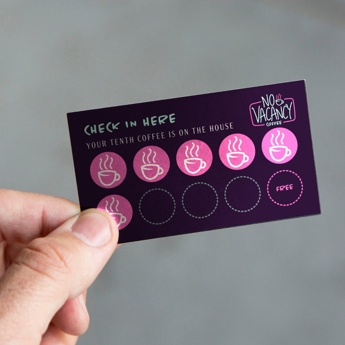
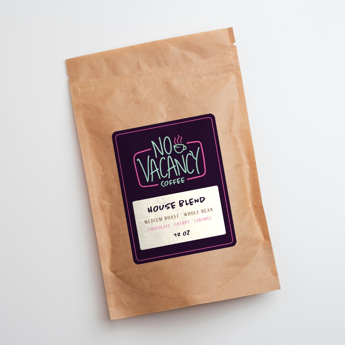
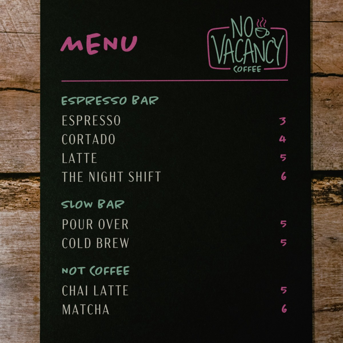
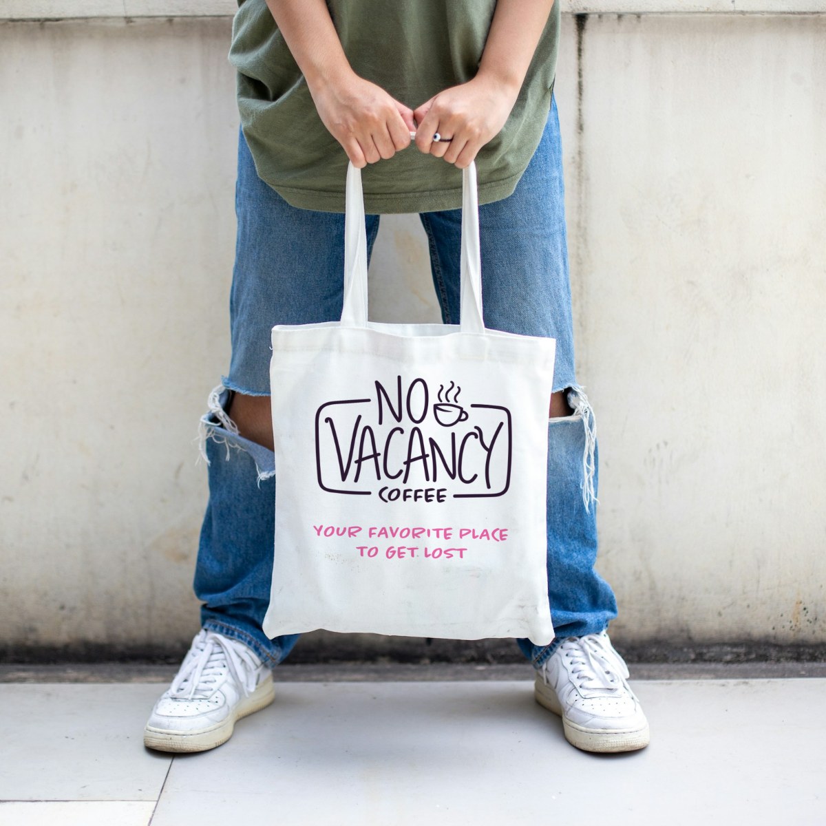
The full identity includes a main logo, a version for light backgrounds, a set of coffee icons, color and type rules, and slogans like “Brewed for the Long Haul.” I brought it to life on a neon sign, cups, a room key loyalty card, stickers, a menu board and social posts, with the motel theme carried into every piece.
up next